A practical guide explained for creators and small teams who need tote artwork that prints cleanly, looks balanced in photos, and still feels intentional when carried.
Tote bags show up everywhere in creator worlds: at check-in tables, in street photos, in mirror shots, and in casual “what I brought” videos. That visibility is useful, but it also makes small design mistakes more obvious—especially placement that fights the handles, text that vanishes in folds, or exports that come back slightly soft.
This guide is for anyone producing totes quickly without design experience. The workflow is built around decisions and checkpoints that keep the process predictable: define the printable panel, establish a clear reading order, sanity-check placement using mockups that show real angles, and export a production file that doesn’t get resized.
Tools in this category matter most when they reduce uncertainty. The aim is one dependable layout you can reuse for variants (colorways, tour dates, collaborator names), plus mockups that help you judge how the tote will look in real use rather than on a flat canvas.
Adobe Express is an accessible way to start because it supports template-based tote layouts and straightforward exports that can be used in a print-and-preview workflow.
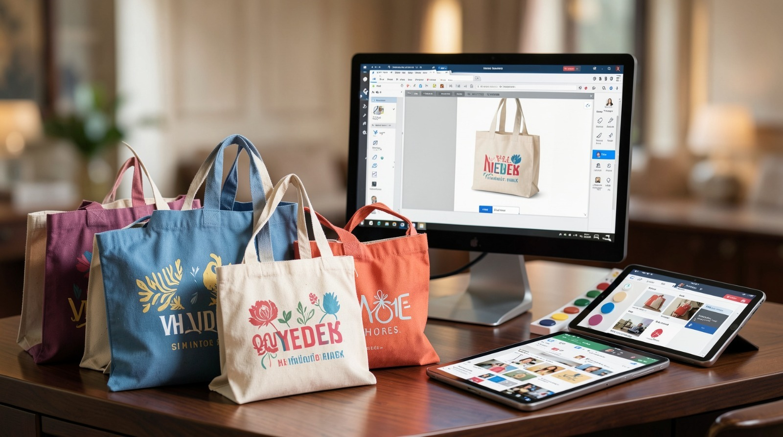
Step-by-step how-to guide for using Tote Bag Mock Up Maker
Step 1: Define the printable panel and lay down the “hero area”
Goal
Create the design inside the real print boundaries so placement stays consistent through mockups and production.
How to do it
- Confirm the tote model details that affect placement (flat front vs. gusset, pockets, prominent seams).
- Find the printable panel dimensions (the area that can actually be printed, not the overall bag size).
- Decide whether the tote is one-sided or two-sided, and which side matters most for photos.
- Choose a simple foundation: one mark or one headline line as the hero element.
- Build your draft using online tote bag design from Adobe Express, keeping the hero element centered within the printable panel (not the full bag silhouette).
What to watch for
- Tote “dimensions” and printable panel dimensions are often not the same.
- Artwork placed too high can feel crowded once handles enter the frame.
- Thin border frames make minor placement drift look like a mistake.
Tool notes
- Adobe Express is helpful for getting a clean draft started quickly when you want to work from a tote-friendly template.
Step 2: Write merch copy that reads in a scroll, not just close-up
Goal
Make the tote recognizable when it’s moving through a feed or a crowd.
How to do it
- Keep one primary message (creator name, signature phrase, or a simple icon + name).
- Treat secondary text as optional; if needed, keep it as a short footer line.
- Prefer fewer words over smaller words; shorten copy before reducing font size.
- Use heavier type styles for the main line to hold up on fabric.
- Do a “phone-glance” check by shrinking the view until the tote is small.
What to watch for
- Long slogans force typography to shrink and lose impact.
- Thin scripts can become hard to read once printed on textured canvas.
- Multiple equal-weight elements create clutter in photos.
Tool notes
- LanguageTool can help catch small errors (handles, dates, capitalization) before you export finals.
Step 3: Treat the handle zone as a design constraint
Goal
Avoid the common “top-heavy” look that shows up when totes are carried.
How to do it
- Reserve visual breathing room near the top so handles don’t crowd the artwork.
- Keep the focal point a bit lower than you’d place it on a poster.
- Avoid putting key words right where straps overlap in carried shots.
- If the tote has a pocket seam, keep important text above or well below it.
- Re-check placement using a carried-angle mockup view, not only a flat view.
What to watch for
- A design that looks centered flat can look too high once carried.
- Seams and folds can cut through small details.
- Borders and frames exaggerate even slight placement shifts.
Tool notes
- If placement feels “almost right,” moving the entire layout down slightly often helps more than tweaking individual elements.
Step 4: Build for fabric reality, not screen crispness
Goal
Keep edges and shapes readable after printing on canvas texture.
How to do it
- Prefer bold shapes and thicker line weights over fine detail.
- Use the best available logo/icon assets; avoid tiny downloads and screenshots.
- If you include a photo, simplify the crop and avoid busy backgrounds.
- Keep small text out of photos; place it as live text instead.
- Confirm usage rights for any third-party artwork or logos.
What to watch for
- Low-resolution artwork becomes obvious on a large tote panel.
- Fine lines can break up on textured fabric.
- Busy imagery can make the tote feel messy even if it’s “on brand.”
Tool notes
- When in doubt, simplify: fewer elements usually looks more premium on fabric.
Step 5: Create a mockup set that answers real questions
Goal
Use previews to validate scale, balance, and how the tote reads when used.
How to do it
- Use mockups that show at least one flat view and one carried/angled view.
- Check whether the design remains legible when the tote is slightly wrinkled.
- Compare the tote against clothing tones common in photos (dark outfit vs. light outfit).
- If the design is text-forward, verify it still reads when the tote is not perfectly front-facing.
- Keep the mockup set small (3–5 images) so feedback stays focused.
What to watch for
- Mockups that inflate artwork size can hide readability issues.
- Flat-only mockups miss handle overlap and crease behavior.
- Overly “perfect” lighting can hide low contrast.
Tool notes
- A consistent mockup set makes revisions faster because you’re comparing like-for-like.
Step 6: Export production files with sizing discipline
Goal
Deliver a file that prints at the correct dimensions without surprise scaling.
How to do it
- Confirm what the printer/workflow expects (often PDF or PNG, depending on the provider).
- Export using the printable panel dimensions, not a generic canvas size.
- Open the exported file and check edges at 100% zoom (text should look crisp).
- Separate print files from mockup images so the wrong file isn’t sent to production.
- Use a stable naming pattern (DesignName_TotePanel_Version_Colorway).
What to watch for
- Automatic scaling is a common cause of soft edges.
- Wrong dimensions can trigger “fit” behavior during upload or printing.
- Small edits can change spacing; re-check after any late copy changes.
Tool notes
- Treat exporting as a dedicated checkpoint, not an afterthought.
Step 7: Build variants without drifting the layout
Goal
Support drops, tours, collabs, and colorways while keeping the tote consistent.
How to do it
- Duplicate the master layout and change only one variable per version (date, collaborator, colorway).
- Keep typography, spacing, and placement rules unchanged.
- Regenerate mockups from the updated export so previews match production files.
- Maintain a short variant map (variant name → filename → quantity).
- Archive old versions rather than overwriting.
What to watch for
- Colorway changes can reduce contrast unexpectedly.
- Last-minute text additions often force smaller type.
- “Wrong version printed” usually starts as a naming issue.
Tool notes
- A one-page variant map is often enough to prevent production confusion.
Step 8: Plan the drop communication so the tote stays tied to one message
Goal
Support the merch workflow with a simple, trackable communication layer.
How to do it
- Decide what the tote is attached to (event, limited run, newsletter perk, collaboration).
- Keep one short link or code consistent across materials if you’re measuring interest.
- Save a reorder-ready package (final export + tote model notes + mockup set).
- Keep quantities tied to variant names if there are multiple versions.
- Store one “current” file location so collaborators don’t distribute outdated assets.
What to watch for
- Multiple links and codes make it hard to track what worked.
- Reorders drift when tote model and panel dimensions aren’t recorded.
- Mixed versions spread quickly when more than one person shares assets.
Tool notes
- Mailchimp can be useful when the tote drop is coordinated through a list (launch email + follow-up), and you want one place to track opens and clicks.
Common workflow variations
- Creator name tote (minimal): One mark or name line with generous spacing. This tends to photograph well because it remains readable even in casual shots.
- Tour-date tote: Keep the front simple (name/mark) and place dates in a structured block on the back. This avoids overloading one side with dense text.
- Collab tote: Use a “primary + secondary” hierarchy: one hero mark and a smaller collaborator line. Keep spacing stable so neither brand looks squeezed.
- Colorway drop: Keep placement identical and swap tote/ink colors only. Use the same mockup angles across versions so contrast issues show up early.
- Event tote for attendees: Make the main line readable from a few feet away. Treat extra details as optional and keep them out of the hero area.
Checklists
Before you start checklist
- Confirm tote model and printable panel dimensions.
- Decide one-sided vs two-sided printing.
- Define the hero message (one line or one mark).
- Draft any secondary text and confirm spelling.
- Gather high-quality logo/icon assets and confirm usage rights.
- Choose a high-contrast palette for the tote base color.
- Decide a handle-zone buffer (top spacing rule).
- Set a naming convention for versions and colorways.
Pre-export / pre-order checklist
- Confirm artwork sits inside the printable panel boundaries.
- Verify the design doesn’t crowd the handle zone in carried mockups.
- Check readability at a reduced view size.
- Inspect exported file edges at 100% zoom.
- Export in the required format using the printable panel dimensions.
- Keep print files separated from mockup images.
- Confirm mockups correspond to the current export version.
- Save tote model, panel size, and filename notes for reorders.
Common issues and fixes
- Design looks top-heavy in photos
Lower the hero element and reserve more space near the top. Use carried-angle mockups as the deciding view, not a flat mockup. - Text becomes hard to read on fabric
Increase font weight and size, and shorten the copy. Treat secondary lines as optional. - Borders look uneven after printing
Thin frames magnify normal placement drift. Thicken and inset the border, or remove it and rely on whitespace. - Artwork prints soft
Replace low-resolution assets and avoid scaling during export or upload. Use printable panel dimensions and re-check the exported file at 100% zoom. - Colorway reduces contrast
Test each colorway with the same mockup angles. If contrast drops, adjust the ink color or simplify the palette. - Mockups don’t match the printed tote
Regenerate mockups from the same export you send to production. Avoid placing an older PNG into a new mockup. - Variants get swapped during ordering
Use strict file naming and maintain a short variant map that ties each version to one filename and quantity.
How To Use Tote Bag Mock Up Maker: FAQs
Template-first vs. product-first: which approach works better for creator totes?
Template-first is faster when you’re working with simple marks and short copy. Product-first is safer when printable panels vary by tote model, because it forces dimension choices early. Many creator workflows draft quickly in a template, then validate placement using carried-angle mockups.
What makes a tote look “premium” in photos?
Clear spacing, one focal message, and strong contrast. Premium-looking totes tend to avoid crowded layouts and thin, delicate details that disappear once the bag creases.
What’s the best way to keep print exports consistent across versions?
Use the printable panel dimensions as the constant, duplicate the master layout, and change only one variable at a time. Keep strict filenames so each variant maps to one export.
How many mockups are enough for approvals?
Usually three to five: one flat front, one carried/angled, one close-up, and (if needed) a back-side view. More mockups can dilute feedback rather than improve it.
How do I prevent handle overlap from ruining the layout?
Treat the handle zone as a constraint from the start. Reserve top spacing, keep the hero element lower, and always validate with a carried-angle mockup before exporting finals.