Many approach the market with a purely speculative mindset. They spend all day glued to screens, watching prices. This constant flickering creates a stressful loop of impulsive moves fueled by panic. It is an exhausting way to manage money.
So, if you want real wealth, stop staring at the scoreboard and start looking at the actual play. In fact, understanding the stock market graphs will give you a secret advantage over this chaos. It will turn intimidating numbers into a clear visual map. You will be able to finally analyse the business behind the ticker.
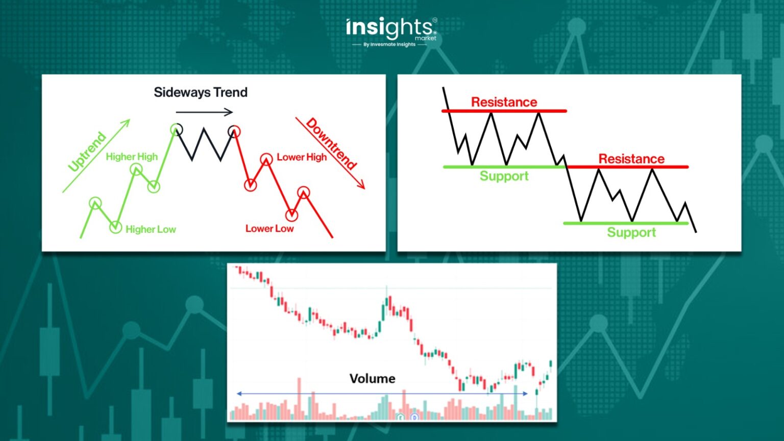
The Invisible Language of Wealth: Why Most Investors are Blind
Reading a 200-page financial report can be exhausting for anyone. In fact, the financial data will only make sense when it is actually understood.
So, exactly what helps here? Well, it’s the authentic visual analysis; it genuinely changes the game.
See, the thing is our brains process images much faster than rows of numbers. When you look at stock market graphs, you are seeing the history of human decisions. You are seeing how a company handles crises and triumphs.
Naturally, a well-constructed graph will help you understand trends that are hardly clear from analysing simple spreadsheets. It will show you the momentum of the business and highlight the consistency of management.
Decoding the Anatomy of a Great Investment
A successful investment strategy requires you to look beneath the surface of daily price action. By focusing on the structural health of a company, you can avoid common market traps. Here’s how it works:
1. Price is the Shadow, Business is the Substance
Most people make the mistake of looking only at the price line. They think a rising line means a “good” stock. Whereas, a falling line means a “bad” one.
Honestly, this is a dangerous oversimplification. Price is merely a shadow cast by the actual business. Therefore, to invest wisely, you must find the “True North” of a company.
Simply put, this is its intrinsic value based on earnings and cash flow. Accurate and reliable graphs allow you to overlay these fundamentals. Just remember,
- When the price line follows the earnings line, the market is rational.
- On the other hand, when they detach, an opportunity or a risk is born. You want to buy the substance, not just the shadow.
2. The Power of Historical Context
Short-term charts are full of too many details.
In fact, you will find that a 10-day chart might show a terrifying drop. Whereas, a 10-year chart might show that the drop is just a tiny blip. This is the “Zoom Out” rule. Long-term stock market graphs provide the context needed for calm.
Moreover, by properly analysing stock market graphs, you can identify if a company is a “growth story” or a “declining giant.” This can be done by understanding how it performed during the last three recessions.
The Three Visual Signals of a “Buy” Opportunity
Smart investing is about identifying high-probability setups where the data supports the price. When you focus on specific visual indicators, you can filter out the opinions of the crowd.
Signal 1: The Valuation Gap
Maximum gains are often found when the current stock price fails to reflect the company’s true value. This happens when the price of a stock falls while its earnings stay strong. Visually, this looks like a widening gap between two lines. Identifying this gap in stock market graphs is like seeing a “sale” sign at a luxury store. It tells you the business is still healthy. Only the market’s perception has changed. This is how professional value investors find bargains.
Signal 2: The Dividend Staircase
For income investors, consistency is everything. You want to see a “staircase” pattern of rising payouts. A graph makes it easy to spot if a company has maintained its dividend through tough times. If the dividend line stays flat or drops, it is a red flag. If it climbs steadily, it signals management’s confidence in future cash flow.
Signal 3: The Recovery Pattern
History often repeats itself in the markets. Certain sectors have predictable recovery arcs after a downturn. By studying past cycles on stock market graphs, you can spot a “bottoming out” phase. This prevents you from “catching a falling knife.” It ensures you wait for the momentum to shift back in your favour.
Protecting Your Capital from Emotional Sabotage
Success in the market is often determined more by your temperament than by your intelligence.
Emotions like the Fear of Missing Out, or taking up big steps based on instincts, often lead to buying at the peak. And then fear leads to selling at the bottom. Eventually, these steps end in great blunders.
So, how should you go about it? Simply rely more on genuine facts and figures like the visual data than emotions and instincts.
Think rationally, analyse your stock market graphs and ask a simple question. “Has the business changed, or just the price?” If the earnings line is still rising, the panic is likely irrational. In fact, the visual proof gives you the “permission” to stay invested. It helps you ignore the crowd. Discipline becomes easier when you rely on visual evidence.
Just strictly stop trading based on how you feel and start trading based on what you see, analyse and understand.
Efficiency From Hours of Research to Seconds of Clarity
In a fast-moving market, the speed and accuracy of your research can be your greatest competitive advantage.
But this calls for smart work, not just hard work.
Manually gathering data from different websites is inefficient. It leads to decision fatigue. Modern investing requires a more streamlined approach.
Integrated tools provide great assistance here; they allow you to see everything in one view. You will be able to see earnings, debt, and price simultaneously. This unified understanding will provide “seconds of clarity.” What’s more, you will be able to scan twenty companies in the time it used to take to research one.
Basically, an efficient use of stock market graphs frees your mind. You no longer struggle with the “what” and the “where.” You can focus entirely on the “why.” This shift in focus is what separates the amateur from the pro.
Conclusion
Building a high-performing portfolio is not about luck; it is about following a visual process that prioritises facts over feelings. Mastering the interpretation of stock market graphs is a skill that compounds over time. It allows you to build a portfolio based on logic rather than hope.
You have learned that price is not value. You have seen how historical context provides peace of mind. You now know how to spot valuation gaps and recovery patterns. The next step is to stop “watching” the market and start “interpreting” it. Every line on a chart has a reason for being there. Your job is to understand those reasons. When you align your capital with fundamental truths, success becomes a matter of time.
If you are ready to stop guessing, it is time to upgrade your toolkit. Utilising professional-grade market graphs can provide the final piece of the puzzle for your long-term success.