Jaguar New Logo: A Modern Identity for a New Era
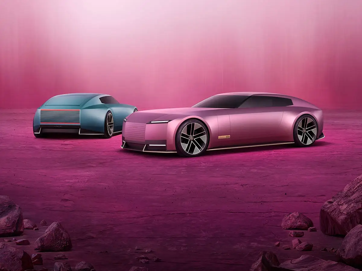
The Jaguar new logo marks one of the most significant branding transformations in the automotive industry in recent years. As the company moves toward an all-electric future, the redesigned identity reflects a broader shift in philosophy, positioning, and target audience. Rather than relying on its traditional chrome leaping feline emblem, Jaguar has introduced a minimalist wordmark and visual system that aims to align with modern design trends and digital-first branding strategies. This change signals the brand’s commitment to innovation, sustainability, and contemporary luxury.
The redesign is not simply a cosmetic update but part of Jaguar’s larger transformation strategy. With electric vehicles becoming central to the brand’s roadmap, Jaguar needed a visual identity that communicates clarity and relevance across digital platforms. Today’s consumers interact with brands primarily on screens, and a simplified logo improves recognition and adaptability. By embracing a refined, typography-driven identity, Jaguar is redefining its image while preparing for a competitive electric luxury market.
What Changed in the Jaguar New Logo Design
The most noticeable change in the Jaguar new logo is the introduction of a stylized wordmark that uses mixed uppercase and lowercase letters. This approach creates visual rhythm while maintaining simplicity. The traditional three-dimensional leaping jaguar, once synonymous with speed and prestige, is no longer the central focus. Instead, the new branding emphasizes typography, geometric balance, and clarity, offering a modern interpretation of luxury branding.
In addition to the wordmark, Jaguar introduced a broader visual identity system that includes graphic elements and a structured design language. The new design uses clean lines, symmetry, and subtle spacing to achieve a minimalist aesthetic. This approach improves scalability across digital platforms, making the logo more adaptable for mobile screens, apps, and infotainment systems. The overall result is a contemporary identity that prioritizes versatility and aligns with modern branding standards.
Why Jaguar Decided to Change Its Logo
Jaguar’s decision to update its logo is closely tied to its transformation into an electric-first luxury brand. As the automotive industry shifts toward sustainability, Jaguar aims to reposition itself for a younger, more tech-savvy audience. The company recognized that its traditional branding, while iconic, was strongly associated with heritage and performance rather than innovation. Updating the logo helps communicate a forward-looking vision aligned with electric mobility and digital experiences.
Market dynamics also played a role in the rebranding decision. Increased competition in the luxury EV segment has pushed traditional automakers to modernize their identities. A refreshed logo allows Jaguar to stand alongside contemporary brands that emphasize minimalism and innovation. By redefining its visual language, Jaguar is attempting to reconnect with evolving consumer expectations and strengthen its presence in the premium electric vehicle market.
Jaguar New Logo vs Old Logo: Key Differences Explained
The difference between the Jaguar new logo and the old emblem highlights a shift from traditional luxury to modern minimalism. The previous logo featured a detailed chrome jaguar in motion, symbolizing speed, elegance, and heritage. This design was highly recognizable and closely tied to Jaguar’s racing legacy. In contrast, the new logo removes complexity and focuses on typography, presenting a cleaner and more adaptable visual identity suited for digital platforms.
Another major distinction lies in branding flexibility. The old emblem was primarily designed for physical applications such as car badges and signage. The new design, however, is optimized for both digital and physical use, making it more versatile across marketing materials and user interfaces. While some enthusiasts feel the redesign reduces emotional impact, others see it as a necessary evolution that aligns Jaguar with modern design trends and future mobility.
Design Philosophy Behind the Jaguar Rebrand

The Jaguar new logo reflects a broader design philosophy centered on modern luxury and creativity. The brand aims to move away from traditional automotive symbolism and adopt a more artistic and expressive identity. This shift is evident in the use of clean typography, structured layouts, and simplified graphic elements. The new design language communicates sophistication while maintaining a distinctive presence in a crowded luxury market.
Another aspect of the philosophy is adaptability. Jaguar’s updated identity is designed to function seamlessly across multiple touchpoints, including websites, mobile applications, and vehicle interfaces. By focusing on simplicity and clarity, the brand ensures consistent recognition regardless of platform. This approach supports Jaguar’s goal of creating a cohesive experience for customers interacting with the brand in both digital and physical environments.
Public Reaction to the Jaguar New Logo
The release of the Jaguar new logo generated strong reactions from both fans and design professionals. Some long-time enthusiasts expressed disappointment over the reduced prominence of the iconic leaping jaguar. For them, the previous emblem represented decades of heritage and performance, and its removal felt like a departure from tradition. Critics also argued that the minimalist approach resembles branding trends seen across various industries.
On the other hand, many branding experts praised the redesign for its clarity and adaptability. They emphasized that modern logos must function effectively across digital platforms and small screen sizes. Supporters of the change believe the simplified design improves versatility while reflecting Jaguar’s electric future. The debate highlights the challenge of balancing heritage with innovation, a common issue faced by legacy brands undergoing transformation.
How the Jaguar New Logo Fits Industry Trends
Jaguar’s redesign follows a broader trend of minimalist branding across the automotive sector. Many car manufacturers have updated their logos to flatter, simpler designs that work better in digital environments. This shift reflects the growing importance of online presence and user interface compatibility. By adopting a streamlined identity, Jaguar aligns itself with the evolving expectations of modern consumers.
The trend also reflects changes in luxury branding. Contemporary luxury emphasizes understated elegance rather than elaborate ornamentation. The Jaguar new logo embraces this philosophy by prioritizing simplicity and clarity. This approach allows the brand to maintain a premium feel while appealing to younger audiences who value modern aesthetics and sustainability.
What the Jaguar New Logo Means for the Brand’s Future
The Jaguar new logo signals a major step in the company’s transformation toward electric mobility. By adopting a modern identity, Jaguar aims to position itself as a forward-thinking luxury brand. The redesign helps communicate innovation and aligns with the company’s plans to introduce new electric models. This cohesive branding strategy supports Jaguar’s long-term vision and strengthens its market positioning.
Beyond visual identity, the rebrand reflects a broader cultural shift within the company. Jaguar is focusing on creativity, sustainability, and digital engagement. The updated logo acts as a symbol of this transformation, representing the brand’s ambition to redefine luxury mobility. While the success of the redesign will depend on future product launches, it clearly sets the stage for Jaguar’s next chapter.
FAQs About the Jaguar New Logo
What is the Jaguar new logo?
The Jaguar new logo is a redesigned brand identity featuring a minimalist wordmark and simplified design elements. It replaces the traditional chrome leaping jaguar with a modern typography-based approach, reflecting the company’s move toward electric luxury and digital branding.
Why did Jaguar change its logo?
Jaguar changed its logo to align with its transition to an electric-first strategy. The new design supports digital platforms, appeals to younger audiences, and reflects modern luxury branding trends. It also helps reposition the brand in a competitive electric vehicle market.
When was the Jaguar new logo introduced?
The Jaguar new logo was unveiled as part of the company’s rebranding initiative during its transformation toward an all-electric future. The redesign coincided with Jaguar’s broader strategy to modernize its image and prepare for upcoming electric vehicle launches.
Is the leaping jaguar completely removed?
The iconic leaping jaguar is not entirely removed but is less prominent in the new branding system. Jaguar has shifted focus to a typography-based identity while retaining elements of its heritage in other brand applications.
Will the new logo appear on future Jaguar cars?
Yes, the new logo is expected to appear across Jaguar’s future branding, including marketing materials, digital platforms, and upcoming electric vehicle models. It represents the company’s unified identity moving forward.
You may also read: How Compliance Impacts Business Continuity Planning