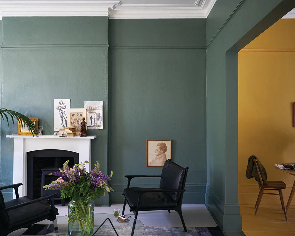
Green Smoke by Farrow & Ball has secured its position as one of the most celebrated, enduring, and discussed interior paint colours across the United Kingdom and the international design landscape. Straddling the delicate aesthetic boundary between a rich, deep green and a sophisticated slate grey, this enigmatic hue introduces a rare synthesis of dramatic depth, historical permanence, and comforting architectural warmth. Unlike traditional, highly saturated primary greens that risk overwhelming a residential footprint, Green Smoke remains masterfully grounded, serving as an exceptional foundation for transitional living environments.
However, successfully realizing the full potential of a Green Smoke living room requires a highly strategic design methodology. Because this specific paint formula is mixed using high-grade, natural earth pigments, its structural appearance responds dynamically to localized environmental fluctuations. Spatial scale, architectural orientation, specific material undertones, daylight exposure, and electrical lighting temperatures all play a critical role in dictating how the colour shifts across the visual spectrum. This comprehensive guide details the precise technical properties, spatial frameworks, color palettes, and styling choices required to transform your living room into an expertly curated, Google-ranking design masterpiece.
Understanding the Technical DNA and Character of Green Smoke
To accurately deploy Green Smoke, one must look beyond its surface-level appeal and analyze its physical coloration properties. Within professional interior architecture frameworks, a paint shade is objectively assessed using its Light Reflectance Value (LRV). The LRV metric functions on a scale from 0% (absolute, pure black absorbing all light) to 100% (pure reflective white). Green Smoke possesses an official Light Reflectance Value of 19 ($LRV = 19$), categorizing it firmly within the medium-dark depth spectrum.
This explicit rating implies that the paint absorbs approximately 81% of visible light hitting its surface. Rather than causing a room to feel restrictively dark, an LRV of 19 allows the walls to recede visually, creating an illusion of boundless depth when balanced with appropriate ambient elements. The complex underlying base mix features an organic blend of deep forest green, heavy slate grey, and minimal midnight blue undertones. This tripartite elemental composition prevents the color from ever rendering flat, allowing it to morph seamlessly through a wide variety of structural roles depending entirely on spatial lighting variations.
How Lighting Variations Dictate Atmospheric Behavior
The natural positioning of your living room windows serves as the primary driver for how Green Smoke registers to the human eye. Below is an expert breakdown of regional light variations and their direct aesthetic impacts.
South-Facing Living Rooms
In living rooms featuring clear south-facing exposures, the space is continually bathed in abundant, warm-toned natural light throughout the peak hours of the day. This golden atmospheric glow counteracts the cool grey and blue undertones embedded within Green Smoke. Consequently, the natural green pigments become heavily elevated, projecting a highly vibrant, welcoming, and organic character. The walls feel intensely alive, mirroring the natural external landscape without crossing into an overly intense or neon territory.
North-Facing Living Rooms
North-facing spaces receive vastly different ambient illumination, characterized by cool, consistent shadows and blue-tinted natural daylight. In this specific setting, Green Smoke leans heavily into its underlying slate-grey base. The color adapts by creating a dramatic, intensely cocooning, and cinematic aesthetic. Rather than fighting this natural phenomenon, designers should embrace it by structuring a cozy, intimate sanctuary. To prevent the environment from feeling overly dark or muddy, the deliberate introduction of highly layered secondary artificial light sources becomes non-negotiable.
Pro Design Tip on Artificial Illumination: Always prioritize electrical light sources emitting a warm Kelvin rating. Light bulbs rated precisely at 2700K (Warm White) accentuate the underlying organic pigments of Green Smoke, while cool bulbs (4000K or above) strip the depth entirely, forcing the paint to look flat and industrial.
Strategic Color Coding: Complementary Farrow & Ball Palettes
Pairing Green Smoke with standard, bright white gloss paint from a local hardware store is one of the most frequent mistakes made by homeowners. The stark, blue-white contrast completely jars against the historical, muted complexity of an LRV 19 paint. Instead, design schemes should utilize specific tonal pairings that share identical pigment bases.
| Color Role | Recommended Farrow & Ball Companion Shade | Aesthetic Execution Purpose |
| Ceiling & Trim | School House White No.291 | A soft, warm off-white that avoids harsh contrast, retaining architectural cohesion. |
| Secondary Neutral | Drop Cloth No.283 | A gritty, mid-toned neutral that grounds alcoves, balancing the green’s weight. |
| Accent Depth | Stiffkey Blue No.281 | An ultra-deep navy that provides rich, sophisticated contrast for custom cabinetry. |
| Warm Counterpart | Jitney No.293 | An earthy, relaxed sandy tone that breaks up dark walls with an inviting texture. |
Spatial Engineering: Small vs. Large Living Rooms
The prevailing myth within outdated design ideology dictates that deep colors must be completely avoided within compact spaces. When applying Green Smoke to small living rooms, the opposite is frequently true. By painting all four walls, baseboards, and window frames in a uniform matte application, you effectively obscure the physical corners and structural boundaries of the room. This seamless color-drenching methodology causes the walls to appear to stretch outward, turning a small, awkward space into an intentional, highly tailored boutique environment.
Conversely, within expansive, open-plan living zones, Green Smoke requires structure so it does not lose its focus. In large architectural footprints, it functions optimally when restricted to dedicated accent zones. Applying Green Smoke exclusively to custom floor-to-ceiling media walls, inset chimney breasts, or structural alcoves allows you to establish distinct functional zones within a broad layout. This anchors your furniture groupings, ensuring the large room feels structured, curated, and fundamentally warm.
Selecting the Ideal Finish for Enhanced Longevity and Depth

The visual success of your walls relies heavily upon the specific paint sheen variant you select. Farrow & Ball offers highly specialized finishes tailored to different lifestyle demands:
- Estate Emulsion (2% Sheen): This is the signature, ultra-matte choice. It provides a powdery, historic, and chalky aesthetic that maximizes the visual depth of Green Smoke’s pigments. However, it is delicate and best reserved for formal, low-traffic spaces.
- Modern Emulsion (7% Sheen): A scuff-resistant, fully washable formulation perfect for busy family living rooms, high-traffic corridors, or households with pets. It offers a beautiful matte appearance while allowing you to clean marks effortlessly.
Styling Furniture, Textures, and Metallics
To fully bring a Green Smoke living room to life, your furniture selections must contrast thoughtfully with the walls. Avoid heavy black or excessively dark espresso-stained woods across the entire space, as they risk absorbing too much light. Instead, introduce central seating upholstered in warm, textured linens like cream, soft oatmeal, or rich camel leather. These materials create an immediate tactile bridge with the wall color.
For metallic accents, move away from cool chrome or industrial brushed stainless steel. Instead, use aged brass, antique gold, or oil-rubbed bronze. The warm, reflective yellow undertones of brass draw out the rich hidden warmth of Green Smoke, adding a subtle touch of luxury. Pair these with natural wood elements, such as reclaimed oak coffee tables or walnut shelving, to ground the scheme in an earthy, organic aesthetic.
Conclusion: Crafting a Timeless Space
Ultimately, a Green Smoke living room rewards careful, structured planning. By respecting its technical properties, managing lighting temperatures, pairing it with historically accurate companion colors, and styling with rich textures, you can craft an interior that transcends passing design trends. It is a color that stands the test of time, delivering an enduring sense of comfort, sophisticated luxury, and personal character for years to come.
Frequently Asked Questions (FAQs)
1. Does Farrow & Ball Green Smoke make a living room feel small?
No, not when executed correctly. While its low LRV of 19 absorbs light, using a color-drenching technique across all walls can obscure structural corners, making a compact room feel incredibly deep, sophisticated, and intentionally cozy.
2. What is the exact Light Reflectance Value (LRV) of Green Smoke?
Green Smoke has an official Light Reflectance Value of 19. This means it sits within the medium-dark depth spectrum, making proper warm-toned layering of artificial lights essential for low-light spaces.
3. Can I use brilliant white paint on the woodwork or ceiling with Green Smoke?
It is highly recommended to avoid stark, brilliant whites, as the high-contrast look can appear jarring. Instead, use nuanced, pigment-rich off-whites like Farrow & Ball’s School House White No.291 or Shaded White No.201 for a seamless, professional transition.
4. Which metallic accents work best against a Green Smoke backdrop?
Warm metallics like aged brass, antique gold, and unlacquered copper complement the green and blue undertones of Green Smoke beautifully, adding instant luxury and visual warmth to the overall living room scheme.
5. Is Estate Emulsion or Modern Emulsion better for a high-traffic living room?
Modern Emulsion is ideal for high-traffic or family living rooms because it features a washable, scuff-resistant 7% sheen. Estate Emulsion offers a beautiful 2% chalky matte finish but is more delicate and suited to low-traffic or formal sitting rooms.
You may also read: Using the YouView App or a Replacement Remote